Thursday, 13 December 2012

My Final Magazine Advert and Audience Feedback

After showing a group of my target audience the magazine advert I made, I asked them to write down what they liked about it, and what they disliked/what they believed could be improved. 


The majority of my target market complimented the simplicity of the magazine advert, and the clear and consistent colour scheme. They also praised how I included all the important information, and how I used the same fonts, colours and pictures I used in my album cover. Quite a lot of my target market, however, found faults in the sizes I had used for the majority of the text. Although the alum title and band name were larger than most of the rest of the text, some of my target market claimed they were not large enough to grab attention. Some suggested that I should have increased the size of 'Destiny's Child' and 'Happy Face' then reduced the size of the rest of the text. Despite this, most of my target market liked the general layout and order of the text, saying that it 'flowed'. 

Sunday, 9 December 2012

Editing my Magazine Advert

Because I am using the same photos that I used for my front cover, I did not need to do a separate photo-shoot for my magazine advert.


To start off, I created a new A4 sized canvas.


I opened up my album cover, and selected the first photo from the top right hand corner of the album cover. I then copied it.


I pasted this photo onto my A4 sized canvas and placed it near the top right hand corner.


I copied and pasted the rest of the pictures from the album cover, one by one, onto the A4 canvas, leaving a small, equal sized gap between each picture. I then added the text 'Destiny's Child' in the same colour and font which I had used on the front cover: 'adobe caslon pro'.


I wanted to add a small diamond to separate each piece of information on the page, so I added a full stop, changed the font to 'lucida calligraphy', which has diamonds as full stops, and increased the font size until the 'diamond' had reached the size I desired.


I added the album title, 'Happy face' underneath, in the same colour and font it had the album's front cover. I made the font size slightly larger than the font used for 'Destiny's Child'. Below that I added another 'diamond'.


Below that I wrote text saying 'the new album' and mentioned two released, 'hit' singles from the album. The text was in the same colour and font used for the text 'Destiny's Child', however the names of the two released singles were in the same colour used for the text 'Happy Face', so that they would stand out slightly. Beneath that I added another 'diamond'. 


I went online and saved a picture of give black stars, to use a ratings on my magazine advert.


I opened up the stars on Adobe Photoshop CS4, then copied and pasted them onto the bottom of the page. I added text underneath of the people who had 'rated' the album. After this I added the release date at the top of the page, and a border around the whole page to make it stand out slightly more.


This is my final magazine advert.


Thursday, 6 December 2012

Drafts for my Magazine Advert

I have drawn a draft for my magazine advert, which has been influenced by my album cover, and my primary and secondary research. 


I am planning on making my album cover very simplistic, with a white background, and minimal text. I will use the same pictures from my album's front cover, laid out in a similar way. At the top of the page I will write the release date in clear, block capitals. Beneath that will be the pictures, and beneath that will be the rest of the text. First of all I will have the band name, in the same colour and font used on the album cover, then underneath will be the album title, also in the same colour and font it was written in on the album front cover. Below that will be some test saying 'the new album' and the names of two successful singles from the album. Underneath that will be 5-star ratings of the album. 

Wednesday, 5 December 2012

Magazine Advert Primary Research

I have created a questionnaire relevant to my magazine advert, and handed it out to a group of my target audience:


QUESTIONNAIRE


Please fill in my questionnaire to help me create a magazine advert for the album I have created for my A2 Media Studies coursework.


(Please circle one answer per question unless instructed to do otherwise)


1.       What genre of music do you usually listen to?


R&B/Hip Hop     Pop    (Indie) Rock     Alternative     Classical     No Specific Genre


2.       What is the main thing that attracts you to a magazine advert for an album?


The Artist’s Face     The Artist’s Name     The Genre     The Images     The Colours


3.       What colours would you expect to see in a magazine advert for a Pop/R&B Girl Group’s album?


Silver     Gold     White     Black     Yellow     Blue     Pink     Purple     Green


4.       What do you think should essentially be included on a magazine advert for an album?


Artist’s Face     Artist’s Name      Album Cover     Released Singles     Release Date


5.       Where in the magazine would you expect to find a magazine advert?


Before/After a Music Related Article     Randomly Placed    


6.       What type of magazine would you expect to see an advert for an album in?


Music Magazine     Gossip Magazine     Newspaper     Other     All of the Above


After collecting my results, I put them into graphs and evaluated them. These results will help me to decide what will be best to put into my magazine advert.


When I asked my target audience what genre of music they usually listen to, the majority was split between 'Pop', 'R&B/Hip Hop' and 'No Specific Genre', which is good because that confirms they are my target market. 


My target audience said that the main things that attract them to a magazine advert for an album are 'the artist's face' and 'the artist's name'. This means that whilst designing my magazine advert, I will ensure that these stand out on the page, not only because of this feedback from my target market but also because it is a convention of magazine adverts for albums. 


When I asked my target market what colours they would expect to see in a magazine advert for a Pop/R&B Girl Group's album, there was a large mix in the answers I received. The colours with the most votes, however, were gold, pink, white and yellow. Because gold, white and yellow match with my current colour scheme, I will try to incorporate these into my magazine advert. 


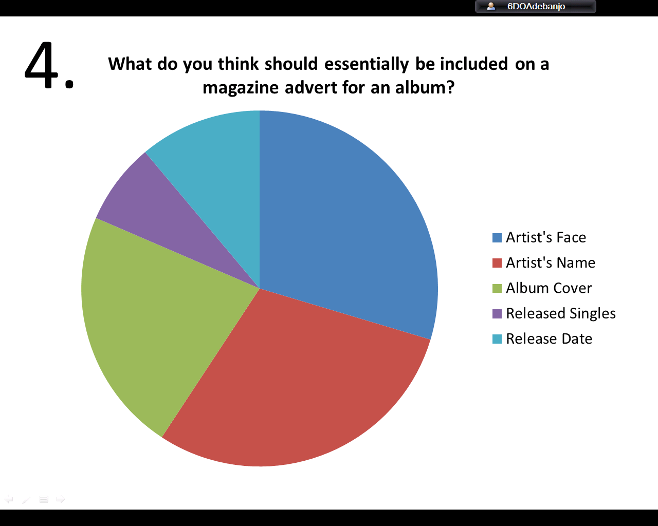
My target audience agreed that the most essential items to be included in a magazine advert for an album are the artist's face, the artist's name and the album cover. All choices I listed in this question, however, are important, so I will be including them all, but I will ensure that the 'essential' items are clearly presented. 


Because the majority of my target audience agreed that a magazine advert for an album cover should be placed before/after a music related article, I would ensure that the advert were placed there if it were real. 


Because the many of my target audience said that they would expect to see the advert in a gossip magazine, or a newspaper, but especially in a magazine, I would ensure that the advert were placed there if it were real. 

Monday, 3 December 2012

Magazine Advert Analysis

I have analysed a small selection of magazine adverts for albums.

OLLY MURS - 'OLLY MURS'


This magazine advert is very simplistic, with a large image and bright red colour used to grab attention. The largest font is 'Olly Murs', which is the name of the artist and the album title, making it the most important information, which is why it has been designed in such a way to stand out the most. This follows the conventions of a typical album magazine advert. 'The Debut Album' and the date of release are the next largest text, instantly informing the reader what is being advertised and when it can be purchased. In smaller writing, there are two released singles mentioned, to grab the attention of those who are familiar with the mentioned singles. All the information included on this advert are things that are conventionally included in album magazine adverts. Although the picture of Olly Murs is in black and white, it still stands out to a degree because the rest of the advert is mostly red, and also because it has such a unique design. The picture of Olly Murs is the same as the picture used on his album cover, as is the font, and the colours:
This shows that there is a lot of consistency, continuity and similarity between the album cover and the magazine advert for the album. This is a convention of album magazine adverts. 


GWEN STEFANI - 'LOVE ANGEL MUSIC BABY'


This magazine advert is more complex than the previous one I analysed, however it still follows many album magazine advert conventions; it has the artist's name in the largest font, then has the album title in the second largest font. It also mentions a few released singles to grab the attention of the people who are familiar with these songs. The release date is mentioned, however it is in surprisingly small font. The company logos are present at the bottom of the page along with the artist's website, and these are also conventions of an album's magazine advert. The picture used for the background of the advert is also present on the album cover, and a small picture of the album cover is present at the bottom of the advert. 
This is the album cover for the album being advertised: 


The font, the colour scheme and the pictures are all the same as the ones used in the advert, which is another convention that this album's magazine advert is following. 


PEARL JAM - 'BACKSPACER'


This magazine advert is slightly different from the typical magazine advert, however it still manages to follow some conventions. It does not follow the convention of having a picture of the band featured, however it does follow the convention of featuring pictures from the album cover, and including the band's name and album title in the largest font, with the release date is in the next largest font. The released singles are mentioned, along with ratings and quotes on the quality of the album, which are all conventions of an album's magazine advert, along with the company logos and websites at the bottom of the page.
This is the album cover for the album being advertised: 


The font, the colour scheme and the pictures are all the same as the ones used in the advert, which is another convention that the album's magazine advert is following. 

Magazine Advert Secondary Research

I have done some secondary research on magazine adverts for albums to help me design my magazine advert appropriately.

I have found the general conventions of a magazine advert:
(http://zoenewmana2media.wordpress.com/2010/09/20/conventions-of-magazine-adverts/)


All magazine adverts have the following conventions within them, which identify the style and genre of the artist or band which is being advertised:name of artist and album

- Name of band/ artist and album- largest font

- date of album release

- bands image/ style

- featuring songs

- form of release (CD, download)

- either photograph or artwork as main image

- record company

- bands website – myspace /official page

- critical quotes, ratings

- set colour scheme

- sponsoring company – institution logo/name/ website, adding credibility to the band

- own style of font which runs through advert – fitting with genre

- Band logo- depends on type of artist

- photograph of band itself- usually use album cover as main image/ album insert

- where to purchase the album -distributor

- All of conventions elements are dependent on the genre of music

- with band, represent each individual member seperately, and in their own sub-style

- either half page, quarter page, or full page layout- album cover or image itself may only take up a small section of the advert page

- The size of the advert demonstrates the advert budget, and the genre of the band- famous rock band can afford a full page back advert, Indie only a quarter page, basic advert


For my magazine advert, I am planning on following some of the general conventions of an album's magazine advert.

Saturday, 1 December 2012

My Final Album Covers and Audience Feedback

After showing a group of my target audience my album covers, I asked them each to write down a few good points and a few bad points on each one.


The majority of the good feedback was in regards to the way I added a white tint to the pictures behind the text, to make the text more visible, and they also enjoyed the happy, playful facial expressions. However, some of my target audience thought that the choice of colours were quite boring, which would be a poor reflection of the vibrant youthfulness of the band members.


A lot of my target audience liked how the text was centralised, and they liked my choice of song titles as they believed that it went well with the album title. Some of my target market commented on how they appreciated the way that the actor's tops matched, as it gave a sense of unity and matched with the colour scheme. Others, did not like how the exact same pictures were used for the front cover and the back cover. Some of my target market also criticised the legal information at the bottom, saying as a spelling mistake, and that some of the writing over one of the actor's hair was hard to read.


The majority of my target audience were fond of my use of the quote, and especially enjoyed the handwriting-style font I used. Some of them commented on how they liked how I continued with the colour scheme, and also how the colour scheme matched the actors. A few mentioned that I had made a punctuation error: 'theres' should have been written as 'there's'. A couple of them also criticized my use of longer, smaller 'photo-strips', saying there were too many photos.


In my feedback for my second inside album cover, a large number of my target audience expressed their appreciation of how the colour scheme, font and background all match well with the rest of the album, and some mentioned how they liked how the capitalized font made the text stand out. Despite this, some others said that they did not like the capitalized font as it made it look like the words were being shouted, and it made the writing look too squashed.


Most of my target audience gave positive feedback for my album cover's spine, and said it looked realistic. They complimented the simplicity and my use of the company logos and barcode number. However some criticized the colours used, saying it was too dull, and that it wouldn't stand out on a shelf.