Wednesday, 19 December 2012

Evaluation: Question 4

4) How did you use media technologies in the construction and research, planning and evaluation stages?

In the construction, research, planning and evaluation stages, I used a variety of media technologies. I used hardware such as a computer scanner, iPhone camera, a Sony Handycam DCR-SR88E camcorder and a Nikon D3100 DSLR camera. I also used software such as search engines and various websites, pickmonkey.com, youtube.com, blogger.com, Microsoft Word, Powerpoint and Excel, paint, Adobe Premiere Pro, Adobe Photoshop CS4 and Windows Live Movie Maker.

For my primary research in my research stage, I used Microsoft Word to create my questionnaires and Microsoft Power-point and Microsoft Excel to put the data I collected into graphs and charts. For my secondary research I used the search engine google.co.uk, which lead me to many various website where I found pictures to analyse and website with useful information on things such as conventions. I also used the website youtube.com for my secondary research, to find the music videos which I analysed.

For my planning stage, I used an iPhone camera to take pictures of the possible locations I was going to use, and I used email to contact the people who own the location I had chosen to film and take photos on. I also emailed the company who own the rights to 'Happy Face' by Destiny's Child, the song I used in my music video. Before filming my outdoor scenes I used bbc.co.uk/weather to check the weather forecast of the area on the date I was planning on filming, to ensure the conditions were sunny. After drawing up my drafts, I used a scanner so I could present the drafts on my blog.

For my construction stage I used a lot more media technologies. For the filming of my music video, I used a Sony Handycam DCR-SR88E, and to take the photos for my ancillary texts I used a Nikon D3100 DSLR camera. To edit my music video, at first I attempted to use Adobe Premiere Pro, however I had problems whilst using this so I edited the video on Windows Live Movie Maker instead. To edit my ancillary texts, first I edited each photo on picmonkey.com, then I uploaded these photos onto Adobe Photoshop CS4 and created my album cover and magazine advert on there.

For my evaluation stage, I used a computer scanner to upload my audience feedback, and I used Windows Live Movie Maker to create video responses to each evaluation question. I used youtube.com to get screenshots of some videos which I included in the video response, and also edited these screenshots on Paint. I also used my blog on blogger.com to answer the evaluation questions.

Throughout all stages I used my blog on blogger.com, to record all my actions as I went along and to upload evidence of my progress.


Tuesday, 18 December 2012

Evaluation: Question 3

3) What have you learned from your audience feedback?

My audience feedback has helped me become aware of what went well and what my target audience liked about my main products and ancillary texts, and the ways in which they could also be improved. Whilst creating my music video, I received feedback from a group of my target audience and my Media Studies teacher. Although a lot of the comments were reasonably positive, some of them suggested I add a wider range of transitions to make the video more interesting, to which my teacher expanded on and said I should associate a different transition with each band member. I then took this advice on board, and added a range of transitions to the music video, including a 'heart' transition to introduce the three girls dancing, a 'dissolve' transition between two shots of my actor playing Beyonce, Jessica Nemeth, and a 'circle' transition before most shots which include balloons. These transitions made my video look more interesting, and my target audience confirmed this when I played my video to them again and asked for their feedback. Some of them also enjoyed how I linked different transitions to each band member. This has taught me that receiving audience feedback can be important as their opinions are useful in perfecting my work. In regards to all other aspects of the music video, my feedback was generally quite positive. Many complimented the lip-syncing and how convincing the actors were. They also praised the scenes with confetti and the scenes with balloons, especially the multicoloured effect I had on some of the balloon scenes. There were some criticisms towards my actor's dance routines, and this has taught me that next time, more care and planning should go into the choreography of the dance routines, and the actors should be given more time to practice, so that, when filming, the routines will be executed much better.

For my ancillary texts, the audience feedback also helped me to understand what went well, and what could be improved. For my album cover, there were positive comments aimed towards my colour scheme and the styling of my actors along with their silly poses. There were also many compliments on the layout of my front cover and back cover. The spine received praise for it's realistic design, and the inside covers received praise for their content. This has taught me that through my ability to combine conventions, original ideas and influential research, I can create a successful, realistic product for my target audience. However, I did receive a few criticisms, as a few individuals saw the colour scheme as 'boring', and mentioned I had made a few typographical errors, such as forgetting the apostrophe in "there's". I have learned from this, that next time, I should proof read all my text to ensure there are no errors in the final product.

In my magazine advert, my target audience commended the way in which I had continued the colour scheme from the album cover, and had used the same pictures, immediately linking the two items. The majority enjoyed the simple layout, and called it 'easy to read'. Some however, suggested the text 'Happy Face' and 'Destiny's Child' could be improved by enlarging the text to make it stand out more. From this feedback I have learned that if I were to do this again, I would make more effort to make the important text stand out more, just as I had made an effort to make the pictures stand out more for anchorage purposes.


Monday, 17 December 2012

Evaluation: Question 2

2) How effective is the combination of your main product and ancillary texts?

I feel that the combination of my main product and ancillary texts is effective, because they blend well visually, are clearly related to one another, and follow most codes and conventions of real media products.

One of the frequently used scenes in my music video includes the band singing in front of a white background. The same background is used for the photos on the album covers and magazine advert. Also, in another frequently used scene in my music video, the band members are in white clothing. The band members are dressed in white/pale clothing in the photos used on the album covers and magazine advert. By using the same background and extremely similar costumes to those used in the music video, the audience will immediately associate the products with one another. In the music video, the hair and make-up is reasonably natural, and this same use of styling is apparent in the photos used in the ancillary texts. Another thing which I have transferred from the music video to the ancillary texts is the order in which the girls appear; in the scenes of my music video which include all three actors singing the chorus or dancing, they are stood (from left to right): Claire Lovell (Kelly), Jessica Nemeth (Beyonce), then Claire Hicks (Michelle). I have placed them in this order in the my layout of the photos used in my ancillary texts.

My second inside album cover contains the lyrics to the song, 'Happy Face', which is the song I used in my music video. The title of the album is 'Happy Face', named after the track I had used in the music video. The colour scheme of the ancillary texts is quite natural, which links well with the outdoor scenes in half of my music video and the natural styling throughout the whole of the video. The simple, natural theme throughout the majority of my main product and ancillary texts is to connote that it is not the material things in life that bring forth happiness, it is the simple, natural, 'beautiful things, that you never think about, like the ocean, moonlight, stars and clouds', as quoted from the lyrics of 'Happy Face'.

Another theme that runs throughout my main product and ancillary texts is the theme of fun and youthfulness. In the music video, this theme is expressed through the dancing, laughing, confetti and balloons, along with the pink colours used for the band's costumes. In the ancillary texts, this theme is expressed through the illusion of a 'photo-strip', and the silly faces the actors are pulling in each picture.

In terms of promoting the song/album, I feel that the products I have made do this well, individually and collectively. In the feedback from the questionnaire I had created as part of my primary research, my target audience had stated that a music video can be nearly as important as the song itself, as a good video can attract more views, therefore resulting in more people listening to the song. Because of this, I made the music video to the best of my ability, and made it fun and fast-paced to grab and hold the interest of the audience, therefore successfully promoting the song. The album cover I made is appealing and promotes itself well because its message and target audience comes across clearly, despite it challenging a few conventions. The album title and colour scheme establish the simple, natural, happy theme of the album, and the age and positions my actors are in, connote that the album is also young and fun, which indicates the genre of music being pop/hip hop. My magazine advert is not successful for the same reasons as the album cover, but also through the use of anchorage, the large picture entices the reader and encourages them to find out more.


Sunday, 16 December 2012

Evaluation: Question 1

1) In what ways does your media product use, develop or challenge forms and conventions of real media products?

Each of the media products I have made, use forms and conventions of real media products. The music video I produced for the song 'Happy Face' by Destiny's Child would most likely be categorized as a concept based music video, because it does not follow a narrative, nor focus on the band performing the song, but instead follows a theme of happiness, nature and purity.

Although the majority of my music video does not directly link with many individual lyrics of the song, the video follows a theme which links to the general message of the song. The song is primarily about happiness, so I ensured I incorporated into the music video elements which connote happiness. I chose to film in the outdoor location of a field because it's wide, open, natural space gave connotations of freedom, and freedom is often associated with happiness. This is similar to one of the music videos I had analysed, Demi Lovato - Skyscraper (http://www.youtube.com/watch?v=r_8ydghbGSg). This video is set in a white desert, and the wide open setting here is most likely being used to connote Demi's new found freedom expressed in the lyrics of her song. Hidden meanings and connotations are conventions of many music videos.

The song I have used is a mix of the genres R&B/Hip Hop and Pop, therefore I have used the conventions of  music videos from both these genres. I have used a R&B/Hip Hop music video convention by including dancing, as dancing and choreography are very common conventions used in R&B/Hip Hop music videos such as Beyonce - Crazy in Love featuring Jay Z (http://www.youtube.com/watch?v=ViwtNLUqkMY). A convention of Pop music videos is for there to be lots of fun, vibrancy and colour in the music video, and I achieved this in my music video through the colourful balloon scenes, and through the pink-ish coloured clothing my actors wore in the indoor scene which had connotations of youth and fun. Many Hip Hop and Pop songs are up-tempo and fast paced, and their music videos have editing styles to match. I followed this convention by using fast-paced editing throughout the majority of my video, and by speeding up the pace of editing at appropriate moments in the song where the song speeds up. This technique is used in the music video for Katy Perry - Hot n' Cold (http://www.youtube.com/watch?v=kTHNpusq654), where the pace of editing speeds up at each chorus with the tempo of the song.

I challenged the convention of iconography and male gaze which are commonly featured in Pop and R&B/Hip Hop music videos, where the women in the video are seen as an object of male desire, and convey and place emphasis on their sexuality through their minimal clothing and through their make-up. The reason I chose to challenge such a frequently present convention, is because the lyrics of the song which I am using are very unique, and very different from most Pop and R&B/Hip Hop songs. Therefore the message of the song is different, which is why I believed the choice of styling and clothing should be different. Most Pop and R&B/Hip Hop songs are about love, attraction and/or partying, which is why heavy make-up and sexual clothing would be appropriate, however the song I have chosen, 'Happy Face', is about happiness, and the satisfaction and joy found in the simple, natural things in life. Therefore I thought innocent clothing and natural styling would be more appropriately suited, which is why I dressed my actors in this way.

For my ancillary tasks I used the majority of the conventions for an album cover and for a magazine advert for an album cover.

When designing my album front cover, the colour scheme was mostly white, with brown and black. These natural colours relate to the natural styling I gave my actors for the music video. The natural theme I used challenges the typical album cover which uses modern and contemporary colours, however this makes my album cover more unique, and despite this there are still other album covers within the same genre that have a natural theme in it's design, such as the cover for 'Beyonce - B'day'. My album cover features the name of the band and the album title, and these are conventions of an album cover.My album's back cover used many more conventions, as it had a centralised list of tracks, a bar-code in the bottom right hand corner, legal information at the bottom and company logos. The layout is quite similar  to the layout of Jessie J's album, 'Who You Are'. I kept the colour scheme consistent from the front cover, to the back cover, to the inside cover and the spines, as this is an important convention that keeps the whole album cover presentable and consistent. The inside covers challenged conventions by having more text than usual, however they were still visually consistent with the rest of the album. The album cover's spin followed the conventions of real media products, with the serial/barcode number on one end, the company logos on the other, and the band name and album title in the centre, with the same fonts and colour scheme used in the rest of the album. This is present on the sine of the album '4' by Beyonce.

For my magazine advert I used anchorage, which is a convention used in nearly all magazine adverts, where the picture acts as the 'hook' to grab hold of the reader's attention, before the text then gives the meaning.The largest item on my magazine advert is the picture, followed by the text for the band name and the album title. These are all conventions which I have used, and which can also be found on other album magazine adverts such as the one for Gwen Stefani's album 'Love Angel Music Baby'. The picture I used was from my album's front cover, and so was the font and the colour scheme. These all, again, are ways in which my media product has used forms and conventions of real media products. My magazine advert also includes the album's release date, successful released singles and ratings, which are all things I found on other magazine adverts I had analysed.


Thursday, 13 December 2012

My Final Magazine Advert and Audience Feedback

After showing a group of my target audience the magazine advert I made, I asked them to write down what they liked about it, and what they disliked/what they believed could be improved. 


The majority of my target market complimented the simplicity of the magazine advert, and the clear and consistent colour scheme. They also praised how I included all the important information, and how I used the same fonts, colours and pictures I used in my album cover. Quite a lot of my target market, however, found faults in the sizes I had used for the majority of the text. Although the alum title and band name were larger than most of the rest of the text, some of my target market claimed they were not large enough to grab attention. Some suggested that I should have increased the size of 'Destiny's Child' and 'Happy Face' then reduced the size of the rest of the text. Despite this, most of my target market liked the general layout and order of the text, saying that it 'flowed'. 

Sunday, 9 December 2012

Editing my Magazine Advert

Because I am using the same photos that I used for my front cover, I did not need to do a separate photo-shoot for my magazine advert.


To start off, I created a new A4 sized canvas.


I opened up my album cover, and selected the first photo from the top right hand corner of the album cover. I then copied it.


I pasted this photo onto my A4 sized canvas and placed it near the top right hand corner.


I copied and pasted the rest of the pictures from the album cover, one by one, onto the A4 canvas, leaving a small, equal sized gap between each picture. I then added the text 'Destiny's Child' in the same colour and font which I had used on the front cover: 'adobe caslon pro'.


I wanted to add a small diamond to separate each piece of information on the page, so I added a full stop, changed the font to 'lucida calligraphy', which has diamonds as full stops, and increased the font size until the 'diamond' had reached the size I desired.


I added the album title, 'Happy face' underneath, in the same colour and font it had the album's front cover. I made the font size slightly larger than the font used for 'Destiny's Child'. Below that I added another 'diamond'.


Below that I wrote text saying 'the new album' and mentioned two released, 'hit' singles from the album. The text was in the same colour and font used for the text 'Destiny's Child', however the names of the two released singles were in the same colour used for the text 'Happy Face', so that they would stand out slightly. Beneath that I added another 'diamond'. 


I went online and saved a picture of give black stars, to use a ratings on my magazine advert.


I opened up the stars on Adobe Photoshop CS4, then copied and pasted them onto the bottom of the page. I added text underneath of the people who had 'rated' the album. After this I added the release date at the top of the page, and a border around the whole page to make it stand out slightly more.


This is my final magazine advert.


Thursday, 6 December 2012

Drafts for my Magazine Advert

I have drawn a draft for my magazine advert, which has been influenced by my album cover, and my primary and secondary research. 


I am planning on making my album cover very simplistic, with a white background, and minimal text. I will use the same pictures from my album's front cover, laid out in a similar way. At the top of the page I will write the release date in clear, block capitals. Beneath that will be the pictures, and beneath that will be the rest of the text. First of all I will have the band name, in the same colour and font used on the album cover, then underneath will be the album title, also in the same colour and font it was written in on the album front cover. Below that will be some test saying 'the new album' and the names of two successful singles from the album. Underneath that will be 5-star ratings of the album. 

Wednesday, 5 December 2012

Magazine Advert Primary Research

I have created a questionnaire relevant to my magazine advert, and handed it out to a group of my target audience:


QUESTIONNAIRE


Please fill in my questionnaire to help me create a magazine advert for the album I have created for my A2 Media Studies coursework.


(Please circle one answer per question unless instructed to do otherwise)


1.       What genre of music do you usually listen to?


R&B/Hip Hop     Pop    (Indie) Rock     Alternative     Classical     No Specific Genre


2.       What is the main thing that attracts you to a magazine advert for an album?


The Artist’s Face     The Artist’s Name     The Genre     The Images     The Colours


3.       What colours would you expect to see in a magazine advert for a Pop/R&B Girl Group’s album?


Silver     Gold     White     Black     Yellow     Blue     Pink     Purple     Green


4.       What do you think should essentially be included on a magazine advert for an album?


Artist’s Face     Artist’s Name      Album Cover     Released Singles     Release Date


5.       Where in the magazine would you expect to find a magazine advert?


Before/After a Music Related Article     Randomly Placed    


6.       What type of magazine would you expect to see an advert for an album in?


Music Magazine     Gossip Magazine     Newspaper     Other     All of the Above


After collecting my results, I put them into graphs and evaluated them. These results will help me to decide what will be best to put into my magazine advert.


When I asked my target audience what genre of music they usually listen to, the majority was split between 'Pop', 'R&B/Hip Hop' and 'No Specific Genre', which is good because that confirms they are my target market. 


My target audience said that the main things that attract them to a magazine advert for an album are 'the artist's face' and 'the artist's name'. This means that whilst designing my magazine advert, I will ensure that these stand out on the page, not only because of this feedback from my target market but also because it is a convention of magazine adverts for albums. 


When I asked my target market what colours they would expect to see in a magazine advert for a Pop/R&B Girl Group's album, there was a large mix in the answers I received. The colours with the most votes, however, were gold, pink, white and yellow. Because gold, white and yellow match with my current colour scheme, I will try to incorporate these into my magazine advert. 


My target audience agreed that the most essential items to be included in a magazine advert for an album are the artist's face, the artist's name and the album cover. All choices I listed in this question, however, are important, so I will be including them all, but I will ensure that the 'essential' items are clearly presented. 


Because the majority of my target audience agreed that a magazine advert for an album cover should be placed before/after a music related article, I would ensure that the advert were placed there if it were real. 


Because the many of my target audience said that they would expect to see the advert in a gossip magazine, or a newspaper, but especially in a magazine, I would ensure that the advert were placed there if it were real. 

Monday, 3 December 2012

Magazine Advert Analysis

I have analysed a small selection of magazine adverts for albums.

OLLY MURS - 'OLLY MURS'


This magazine advert is very simplistic, with a large image and bright red colour used to grab attention. The largest font is 'Olly Murs', which is the name of the artist and the album title, making it the most important information, which is why it has been designed in such a way to stand out the most. This follows the conventions of a typical album magazine advert. 'The Debut Album' and the date of release are the next largest text, instantly informing the reader what is being advertised and when it can be purchased. In smaller writing, there are two released singles mentioned, to grab the attention of those who are familiar with the mentioned singles. All the information included on this advert are things that are conventionally included in album magazine adverts. Although the picture of Olly Murs is in black and white, it still stands out to a degree because the rest of the advert is mostly red, and also because it has such a unique design. The picture of Olly Murs is the same as the picture used on his album cover, as is the font, and the colours:
This shows that there is a lot of consistency, continuity and similarity between the album cover and the magazine advert for the album. This is a convention of album magazine adverts. 


GWEN STEFANI - 'LOVE ANGEL MUSIC BABY'


This magazine advert is more complex than the previous one I analysed, however it still follows many album magazine advert conventions; it has the artist's name in the largest font, then has the album title in the second largest font. It also mentions a few released singles to grab the attention of the people who are familiar with these songs. The release date is mentioned, however it is in surprisingly small font. The company logos are present at the bottom of the page along with the artist's website, and these are also conventions of an album's magazine advert. The picture used for the background of the advert is also present on the album cover, and a small picture of the album cover is present at the bottom of the advert. 
This is the album cover for the album being advertised: 


The font, the colour scheme and the pictures are all the same as the ones used in the advert, which is another convention that this album's magazine advert is following. 


PEARL JAM - 'BACKSPACER'


This magazine advert is slightly different from the typical magazine advert, however it still manages to follow some conventions. It does not follow the convention of having a picture of the band featured, however it does follow the convention of featuring pictures from the album cover, and including the band's name and album title in the largest font, with the release date is in the next largest font. The released singles are mentioned, along with ratings and quotes on the quality of the album, which are all conventions of an album's magazine advert, along with the company logos and websites at the bottom of the page.
This is the album cover for the album being advertised: 


The font, the colour scheme and the pictures are all the same as the ones used in the advert, which is another convention that the album's magazine advert is following. 

Magazine Advert Secondary Research

I have done some secondary research on magazine adverts for albums to help me design my magazine advert appropriately.

I have found the general conventions of a magazine advert:
(http://zoenewmana2media.wordpress.com/2010/09/20/conventions-of-magazine-adverts/)


All magazine adverts have the following conventions within them, which identify the style and genre of the artist or band which is being advertised:name of artist and album

- Name of band/ artist and album- largest font

- date of album release

- bands image/ style

- featuring songs

- form of release (CD, download)

- either photograph or artwork as main image

- record company

- bands website – myspace /official page

- critical quotes, ratings

- set colour scheme

- sponsoring company – institution logo/name/ website, adding credibility to the band

- own style of font which runs through advert – fitting with genre

- Band logo- depends on type of artist

- photograph of band itself- usually use album cover as main image/ album insert

- where to purchase the album -distributor

- All of conventions elements are dependent on the genre of music

- with band, represent each individual member seperately, and in their own sub-style

- either half page, quarter page, or full page layout- album cover or image itself may only take up a small section of the advert page

- The size of the advert demonstrates the advert budget, and the genre of the band- famous rock band can afford a full page back advert, Indie only a quarter page, basic advert


For my magazine advert, I am planning on following some of the general conventions of an album's magazine advert.

Saturday, 1 December 2012

My Final Album Covers and Audience Feedback

After showing a group of my target audience my album covers, I asked them each to write down a few good points and a few bad points on each one.


The majority of the good feedback was in regards to the way I added a white tint to the pictures behind the text, to make the text more visible, and they also enjoyed the happy, playful facial expressions. However, some of my target audience thought that the choice of colours were quite boring, which would be a poor reflection of the vibrant youthfulness of the band members.


A lot of my target audience liked how the text was centralised, and they liked my choice of song titles as they believed that it went well with the album title. Some of my target market commented on how they appreciated the way that the actor's tops matched, as it gave a sense of unity and matched with the colour scheme. Others, did not like how the exact same pictures were used for the front cover and the back cover. Some of my target market also criticised the legal information at the bottom, saying as a spelling mistake, and that some of the writing over one of the actor's hair was hard to read.


The majority of my target audience were fond of my use of the quote, and especially enjoyed the handwriting-style font I used. Some of them commented on how they liked how I continued with the colour scheme, and also how the colour scheme matched the actors. A few mentioned that I had made a punctuation error: 'theres' should have been written as 'there's'. A couple of them also criticized my use of longer, smaller 'photo-strips', saying there were too many photos.


In my feedback for my second inside album cover, a large number of my target audience expressed their appreciation of how the colour scheme, font and background all match well with the rest of the album, and some mentioned how they liked how the capitalized font made the text stand out. Despite this, some others said that they did not like the capitalized font as it made it look like the words were being shouted, and it made the writing look too squashed.


Most of my target audience gave positive feedback for my album cover's spine, and said it looked realistic. They complimented the simplicity and my use of the company logos and barcode number. However some criticized the colours used, saying it was too dull, and that it wouldn't stand out on a shelf.

Friday, 30 November 2012

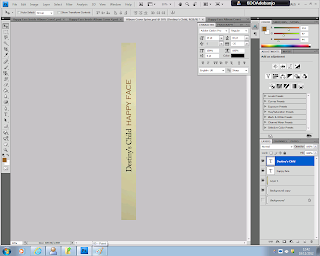
Editing the Album Cover's Spine


To create the album cover's spine, I created a canvas sized 1cm x 12cm.


I selected and copied a small section of the background of one of the photos I had previously edited and used in my album cover.


I pasted this onto my 1cm x 12cm canvas then stretched it out to fit the whole length of the canvas.


After stretching it out, I used the brush tool, in colour white, at a low opacity, to make the whole thing slightly paler.


I added the text 'Happy Face' in the same font and colour I had used for the same text on the front cover. I rotated the text then placed it near the centre of the spine, but slightly higher.


Next I added the text 'Destiny's Child' in the same font and colour I had used for the same text on the front cover. I rotated the text then placed it beside 'Happy Face', in the centre but slightly lower.


I pasted the company logos that I had previously used on the bottom of my album's back cover, rotated them, then placed them at the bottom of the spine.


I then copied out the numbers on the barcode on my album's back cover, rotated the text then placed it at the top of the spine.


I used the brush tool again, in colour white, at a low opacity, to put a slight, white highlight behind the album title and the band name, so that they stand out on the spine.


This is my final album cover spine.

Thursday, 29 November 2012

Editing the Album's Second Inside Cover


For the second inside cover of my album I used the dark brown tinted canvas I had created previously for my first inside cover, then used the blur tool on the whole picture, to put the photo-strips out of focus.


I then went online and copy and pasted the lyrics to the song 'Happy Face', which is also the album title.


I pasted the lyrics into three columns along the page. I used the font 'copperplate gothic light', which is the same font I used to write 'Happy Face' on the front cover, however, here I used it in the colour white.


This is my final album cover inside 2. 


Wednesday, 28 November 2012

Editing the Album's First Inside Cover


Just as I did for my album's front and back cover, I created photo-strips for the inside covers. However, this time each strip was 2cm x 12cm, meaning there were to be six strips (two for each band member), with eight pictures per strip.


I created a 2cm x 1.5cm canvas for each picture.


Because I needed more pictures of each band member for the inside cover, I edited a few more pictures using the same effects on the same website (picmokey.com) that I had used previously. I opened up my first picture onto Adobe Photoshop CS4. 


I copied and pasted the first picture into my 2cm x 1.5cm canvas, where I reduced the size of the picture to fit into that canvas.


Then I selected the small picture and copied it.


I pasted it onto the 2cm x 12cm canvas, then moved it to the top.


I then repeated this for the next seven pictures, until I filled up the whole photo-strip  I copied this strip onto my 12 cm x 12cm canvas.


I then deleted four of the pictures from the first strip, and moved around the remaining pictures on the strip. Next I pasted in four different pictures of the same actor, still pulling silly faces. I then copied this new strip onto my 12cm x 12cm canvas.


After repeating these steps for four more photo-strips with the other two actors, I used the brush tool  at a reasonably low opacity, in the colour brown, to give the whole thing a dark, brown tint. 


I used a 'handwriting' style font to write a quote by the lead singer of the band, because it gives the quote a more personal feel. I used white for the font, to make it stand out more against the dark tinted background.


In realised that the type of font I used was a little bit hard to read, so I increased the boldness of it. I also added '-Beyonce' below the quote.


I did not increase the thickness of '-Beyonce', to make sure that the audience does not mistake her name for part of the quote.


This is my final inside cover 1.